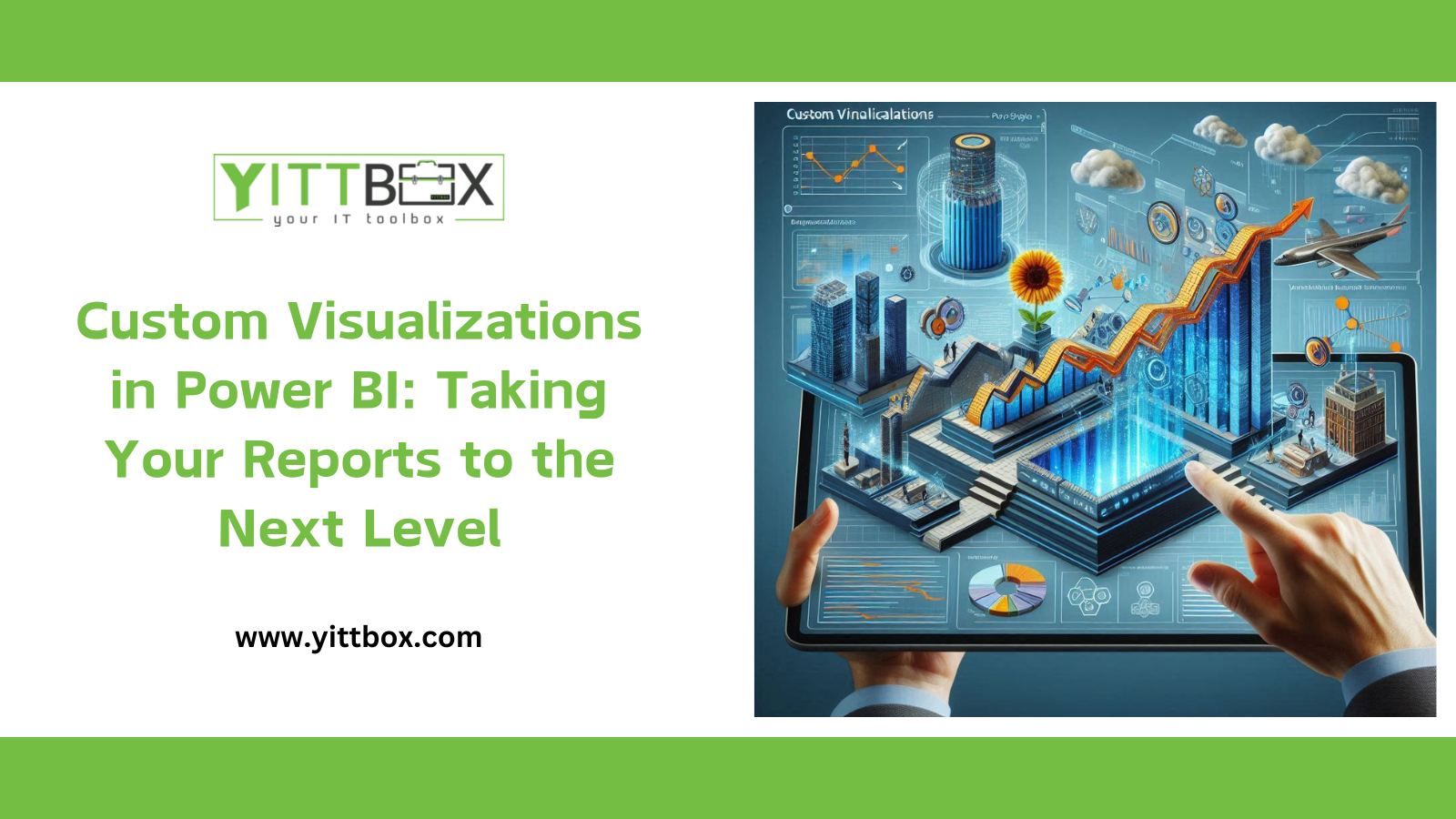
Custom Visualizations in Power BI: Taking Your Reports to the Next Level
In today's data-driven world, the ability to visualize data effectively is crucial for making informed business decisions. Power BI, a powerful business analytics tool by Microsoft, allows users to create interactive and immersive visualizations. While Power BI offers a wide range of built-in visuals, custom visualizations can take your reports to the next level, providing tailored insights and enhancing the overall user experience.
Why Custom Visualizations Matter
Custom visualizations in Power BI provide several advantages over standard visuals:
- Tailored Insights: Custom visuals allow you to present data in a way that is specific to your business needs, ensuring that the insights derived are relevant and actionable.
- Enhanced User Experience: Unique and interactive visuals can make reports more engaging, helping users to understand complex data more easily.
- Brand Consistency: Custom visuals can be designed to align with your company’s branding, ensuring a cohesive look and feel across all reports.
- Extended Functionality: By creating custom visuals, you can incorporate features that are not available in Power BI’s default visualizations, providing more flexibility and control over your data presentation.
Getting Started with Custom Visualizations in Power BI
Creating custom visualizations in Power BI may seem daunting, but with the right tools and resources, it becomes manageable. Here are the steps to get you started:
1. Identify Your Requirements
Before diving into the creation process, clearly define what you want to achieve with your custom visualization. Consider the type of data you are working with, the insights you want to convey, and the audience for your report.
2. Use the Power BI Custom Visual SDK
Microsoft provides a Custom Visual SDK that simplifies the process of creating custom visuals. The SDK includes tools and libraries that help you develop, test, and deploy your visuals.
3. Develop Your Visual
Developing a custom visual involves writing code, typically in TypeScript and using the D3.js library for data manipulation and visualization. Here’s a simplified overview of the development process:
- Set Up Your Environment: Install Node.js, TypeScript, and the Power BI Visual Tools.
- Create a New Visual: Use the Power BI Visual Tools to create a new project.
- Develop the Visual: Write the code to define how your visual will render the data.
- Test the Visual: Use the Power BI service or Desktop to test your visual with real data.
4. Package and Publish
Once your visual is developed and tested, you can package it for distribution. Power BI visuals can be shared internally within your organization or published to the Microsoft AppSource for public use.
Best Practices for Custom Visualizations
To ensure your custom visualizations are effective and user-friendly, consider the following best practices:
1. Keep It Simple
While it may be tempting to create complex visuals, simplicity often leads to better understanding and usability. Focus on conveying the most important insights clearly.
2. Ensure Responsiveness
Your visualizations should be responsive, adapting to different screen sizes and resolutions. This ensures that users have a consistent experience across various devices.
3. Optimize Performance
Large datasets can slow down your visuals, affecting the user experience. Optimize your code to handle data efficiently and ensure quick rendering times.
4. Provide Interactivity
Interactive elements, such as tooltips, filters, and drill-down capabilities, can make your visualizations more engaging and informative. Users should be able to explore the data easily.
5. Maintain Accessibility
Ensure that your custom visuals are accessible to all users, including those with disabilities. Follow accessibility guidelines and provide alternative text and keyboard navigation support.
Real-World Applications of Custom Visualizations
Custom visualizations can be applied across various industries and use cases. Here are a few examples:
1. Financial Services
In the financial sector, custom visuals can be used to create advanced charts and graphs that illustrate market trends, portfolio performance, and risk assessments.
2. Healthcare
Healthcare providers can use custom visuals to track patient outcomes, visualize medical research data, and monitor hospital performance metrics.
3. Retail
Retail businesses can benefit from custom visuals to analyze sales data, customer behavior, and inventory levels, helping to optimize operations and improve profitability.
4. Education
Educational institutions can leverage custom visuals to track student performance, analyze survey results, and visualize research findings.
Conclusion
Custom visualizations in Power BI offer a powerful way to enhance your reports, providing tailored insights and a better user experience. By understanding your requirements, utilizing the Power BI Custom Visual SDK, and following best practices, you can create visuals that truly take your reports to the next level. Whether you're in finance, healthcare, retail, or education, custom visuals can help you unlock the full potential of your data, driving better decision-making and business outcomes.
Explore the possibilities of custom visualizations in Power BI today and see how they can transform your data into actionable insights.


